The results dashboard follows the same structure across all three experiment types — Geo Lift, A/B Test, and Conversion Lift. This article explains each section and how to interpret it. Where Conversion Lift differs from Geo Lift and A/B Test, this is noted explicitly.
Headline metrics
The top section of the results page gives a quick summary of both business impact and result quality.
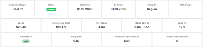
Spend
The total media spend during the test window. For Geo Lift and A/B Test, this is the incremental spend relative to the counterfactual — the increase in investment compared to what would have been spent without the treatment. For Conversion Lift, this is the total spend reported directly by Meta. Only shown when media data is available.
Incremental sales
The estimated business impact caused by the treatment — the sales that would not have occurred without the intervention. For Geo Lift and A/B Test, this is derived from Sellforte's own counterfactual model. For Conversion Lift, this is Meta's reported incremental sales figure from the holdout study.
Test iROAS
The incremental return on ad spend generated by the treatment. For Geo Lift and A/B Test, this is calculated by Sellforte from its own modelled incremental sales and spend figures. For Conversion Lift, it is derived by Sellforte from the incremental sales and spend values reported by Meta. Only shown when media data is available.
For example, a test iROAS of 3.49 means that each additional unit of spend generated 3.49 units of incremental revenue during the test window.
iROAS 90% CI
The 90% credible interval for the iROAS estimate. This shows the range within which the true iROAS is likely to fall, reflecting the uncertainty in the estimate. For Geo Lift and A/B Test, this is derived from Sellforte's Bayesian model. For Conversion Lift, it is derived by Sellforte from the incremental sales confidence interval bounds reported by Meta.
For example, an iROAS 90% CI of 3.26–3.72 means there is 90% confidence the true incremental return falls within that range. A narrower interval indicates a more precise estimate.
Sales lift
The percentage by which the test group's sales exceeded the counterfactual during the treatment period. This provides a relative measure of the treatment effect that is easy to communicate.
Confidence
The probability that the treatment effect is positive. A confidence of 100% means the result is certain to reflect a positive incremental effect. Higher confidence generally means stronger evidence of real impact. For Geo Lift and A/B Test, this is derived from Sellforte's posterior treatment effect distribution. For Conversion Lift, it is Meta's reported confidence figure from the holdout study.
R-squared
A measure of how well the synthetic control matched the test group during the pre-treatment period. Values closer to 1 indicate a stronger pre-treatment fit, which makes the counterfactual projection more credible. Lower values suggest the control groups were less able to replicate the test group's historical behaviour, and the result should be interpreted with more caution.
R-squared is only present for Geo Lift and A/B Test. Conversion Lift does not include this metric, as there is no synthetic control or pre-treatment fitting involved.
Number of observations and predictors
The number of time periods used in the pre-treatment training window, and the number of control groups used to construct the synthetic control. These describe the structure of the analysis and the data supporting the estimate.
Number of observations and predictors are only present for Geo Lift and A/B Test.
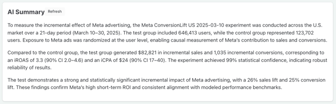
The AI Summary
Sellforte generates an AI summary automatically after each experiment is analysed. It is designed to turn the quantitative outputs into a concise, business-readable narrative.
For Geo Lift and A/B Test, the AI Summary typically covers:
- The test design and what was measured
- How the synthetic control was constructed
- The estimated incremental effect and credible intervals
- A business-level interpretation of the result
For Conversion Lift, the AI Summary covers the same ground but references the Meta study design — including the randomised holdout setup, test and control group sizes, and the incremental effect reported by Meta — rather than a synthetic control.
In all cases, the AI Summary is often the fastest way to understand what happened and communicate the result to marketing, finance, or leadership stakeholders.
The charts
Geo Lift and A/B Test both produce a full set of time-series charts showing actual versus counterfactual performance over time. Conversion Lift shows only the iROAS distribution chart, since Meta's export provides summary statistics rather than daily time-series data. The iROAS distribution is described last in this section and applies to all three experiment types.
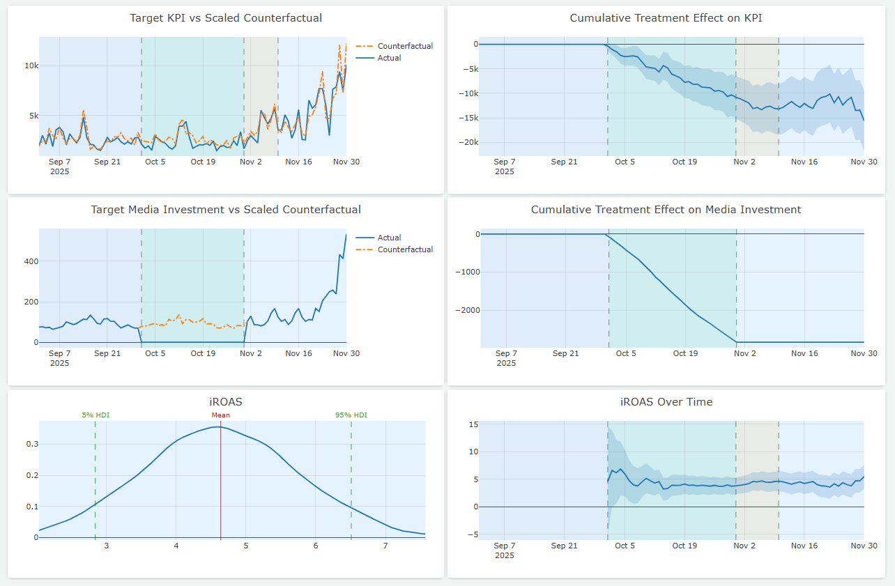
Target KPI vs. Scaled Counterfactual
This chart compares actual performance in the test group against the counterfactual — the model's estimate of what would have happened without the treatment. The treatment period is highlighted.
The counterfactual is scaled to match the test group's level during the pre-treatment period, regardless of the absolute size of the test and control groups. This makes the comparison visually intuitive even when groups differ significantly in scale.
A gap between the actual and counterfactual lines during the treatment period indicates a treatment effect. If actual performance is above the counterfactual, the treatment had a positive impact. If below — as in a go-dark or spend reduction test — it suggests the channel or activity had been driving incremental value.
A shaded band around the counterfactual line shows the credible range of no-treatment outcomes, reflecting the uncertainty in the model's estimate.
Target KPI vs. Scaled Counterfactual is only present for Geo Lift and A/B Test.
Cumulative Treatment Effect on KPI
This chart shows how the incremental impact accumulates over time. It is calculated by summing the daily differences between actual performance and the counterfactual.
A typical pattern:
- Flat before the treatment period — no effect yet
- Rising during the treatment window — cumulative impact building
- Continued movement during the cool-down period, if carry-over effects are present
- Stabilising after the cool-down ends
The final value of this chart represents the total estimated incremental effect of the experiment. A credible interval band shows the range of uncertainty around that estimate.
If the line continues to rise meaningfully during the cool-down period, that suggests the treatment had ongoing effects after it ended and that the cool-down window is capturing real incremental value.
Cumulative Treatment Effect on KPI is only present for Geo Lift and A/B Test.
Target Media Investment vs. Scaled Counterfactual
This chart shows actual media spend in the test group versus the counterfactual spend. It is only present when media data has been uploaded.
Its primary purpose is to confirm that the treatment was applied as intended — that spend changed materially during the test window and that the intervention is clearly visible in the data. If the media chart does not show a meaningful divergence, the experiment may not have had sufficient treatment intensity.
Target Media Investment vs. Scaled Counterfactual is only present for Geo Lift and A/B Test, and only when media data has been uploaded.
Cumulative Treatment Effect on Media Investment
The cumulative version of the media chart, showing how incremental spend accumulated over the experiment window. Used alongside the KPI cumulative chart to contextualise the iROAS estimate.
Cumulative Treatment Effect on Media Investment is only present for Geo Lift and A/B Test, and only when media data has been uploaded.
iROAS distribution
This chart shows the full probability distribution of likely iROAS outcomes. It is present for all three experiment types when media data is available.
Key elements:
- Mean — the central iROAS estimate, shown as a vertical line
- 5% HDI and 95% HDI — the lower and upper bounds of the 90% Highest Density Interval, representing the credible range of likely iROAS values
- The shape of the curve — shows where outcomes are most concentrated
If the entire distribution sits above zero, that indicates strong evidence of positive incrementality. A narrower distribution indicates a more precise estimate. The 90% CI is also shown as a headline metric in the results summary.
For Geo Lift and A/B Test, the distribution is derived from Sellforte's Bayesian model. For Conversion Lift, it is derived by Sellforte from the incremental sales confidence interval bounds reported by Meta. The chart looks and reads the same in both cases.
Test and control groupsThis section shows how the synthetic control was constructed. It lists:
- The test group or groups
- Each control group and its weight in the synthetic control
The weights sum to 1 and can be interpreted directly: a control group with a weight of 0.66 explains 66% of the test group's pre-treatment behaviour. This makes the experiment transparent and gives you a clear view of which control groups were most influential in building the counterfactual.
For Geo Lift, control groups are geographic regions. For A/B Test, they are whatever groups were included in the uploaded control columns. The interpretation of the weights is the same in both cases. This section is not present for Conversion Lift, as the holdout groups are defined and managed by Meta rather than by Sellforte.
Uploads
The Uploads section shows the files that were used to run the experiment, along with their upload status. It is present for both A/B Test and Conversion Lift experiments, where data is uploaded rather than sourced from Sellforte's data pipeline. It is not present for Geo Lift.
Each file is listed with its name, size, upload timestamp, and status. A status of Ready confirms that the file was uploaded and validated successfully.
Comments
The Comments section at the bottom of the results page allows you to add notes directly to the experiment.
Use comments to:
- Record business context around the experiment
- Document conclusions and decisions
- Note follow-up actions or calibration recommendations
- Capture observations that are not reflected in the quantitative outputs
This is a simple but important way to preserve the learning from each experiment, especially when results are later used to support MMM calibration or budget planning.
Admin diagnostics
A Show admin diagnostics link is visible at the bottom of the results page. This section contains technical information that is primarily relevant for diagnosing issues if an experiment fails or produces unexpected results. It does not need to be reviewed as part of a standard experiment readout.