How should I interpret the difference between MMM and Google Analytics reported numbers?
Marketing Mix Modeling (MMM) aims to report the true incrementality of your media spend.
Google Analytics, on the other hand, reports attribution — it assigns credit to channels but does not indicate how much of that impact was truly incremental.
Because of this fundamental difference, it is expected to see significant discrepancies between MMM results and Google Analytics numbers.
Example:
Google Analytics may show Google Search Brand as highly efficient. However, not all brand searches are incremental or driven by ads. Many customers already know your brand and would visit your website even if they had not seen a brand ad. MMM adjusts for this and only credits the incremental portion of impact.
How promotion-driven sales are measured
Sellforte’s Marketing Mix Modeling identifies promotion-driven sales by analyzing historical sales patterns alongside promotional activity data.
-
Promotional activity is provided to the model as daily inputs, reflecting when promotions were active and how strong they were.
-
The model evaluates how changes in promotional intensity have historically influenced total sales.
-
Based on these patterns, MMM separates:
-
baseline sales
-
promotion-driven uplift
-
media-driven incremental impact
-
In the Sellforte UI, promotion-driven sales are shown as a separate component, making it easy to understand:
-
how much sales uplift came from promotions
-
how promotion impact evolved over time
Unlike attribution tools, MMM can explicitly disentangle the effect of promotions from the effect of media. This is especially valuable during high-promotion periods such as Black Week or seasonal peaks, when both discounts and media activity increase simultaneously.
How investments are allocated to Own Channels
Defining investments for Own Channels (such as email or SMS) differs from paid media, as these channels typically do not have a direct spend per send.
In most implementations, Sellforte uses a proxy-based approach to reflect the relative scale of Own Channel activity:
-
When available, data from platforms such as GA4 or Klaviyo is used to observe the sales value attributed to email or SMS.
-
A common approach is to estimate spend as 10% of the attributed sales value.
-
This proxy reflects operational and resource investment and provides a consistent input over time.
Example:
-
Email is attributed 100 USD in sales by the platform
-
Proxy spend is defined as 10% → 10 USD
-
MMM determines that 50% of the attributed sales were truly incremental
Result:
-
Incremental sales: 50 USD
-
Spend: 10 USD
-
Incremental ROAS: 5
This approach allows MMM to consistently evaluate Own Channels even without explicit spend data.
Why don't the KPI scorecard and time series chart show the same incremental revenue?
When reviewing the MMM dashboard, you may notice that the incremental sales figure in the KPI scorecard does not match the total shown in the time series chart for the same period. This is expected behaviour and reflects two different ways of placing results on the timeline in Sellforte.
The two views use different logic. The time series chart shows raw data: sales are placed on the date they actually happened. Because marketing activity often takes days or even weeks to drive sales, the impact of a campaign can appear on a later date than the spend itself.
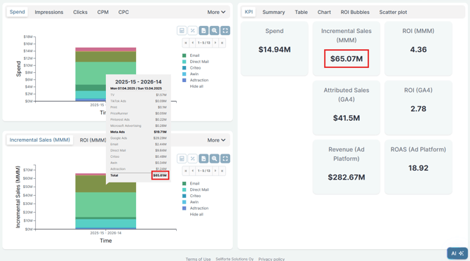
The KPI scorecard uses backtracing. Here, sales are tied back to the day the marketing activity that drove them took place. This aligns spend and the resulting impact on the same date, making it easier to evaluate efficiency over a chosen period.
When the dashboard is filtered to a specific time window, these two logics can produce different totals. Over long enough time horizons the views converge, but for shorter windows the difference can be visible.
Which view should I use? Use the time series chart when you want to see when sales actually materialised. Use the KPI scorecard when you want to assess the efficiency of marketing activity during a specific period, since backtracing ties spend and impact to the same dates.